Visualising confidence in multi-class classification problems
It is best practise to visualise the confidence of predictive models whenever possible. With binary classification in two dimensions this is particularly straightforward since confidence that is lost from one class is necessarily gained by the other. With more classes the visualisation becomes less straightforward: confidence can be lost to any combination of classes and to each at different rates. Voronoi diagrams are a popular way of displaying multi-class predictions, but unfortunately these do not directly show predictive confidence. In this post I briefly describe and give code for a method that embeds multi-class confidence in predictive diagrams.
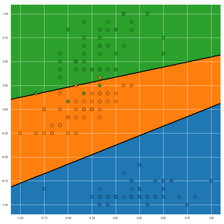
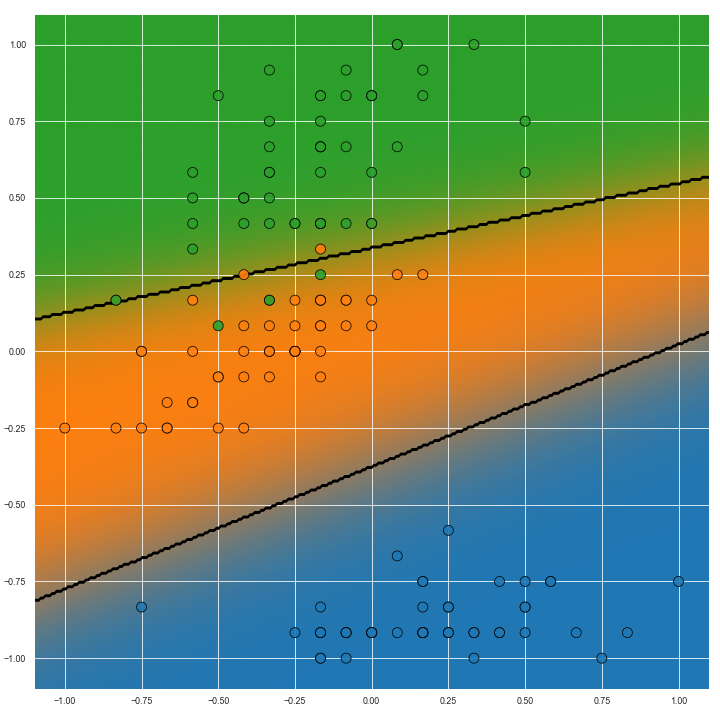
The image below shows the Voronoi diagram of the second and fourth dimensions of the Iris dataset on the left. On the right, Voroni diagram adjusted for predictive confidence is shown.
The core of this function is pasted here:
cols = sns.color_palette(cmap, n_classes)
pp_rgba = np.zeros((n_samples, n_samples, 4))
for ci, pi in zip(cols, pp.T):
    cmap_i = pl.cm.colors.ListedColormap(ci)
    pi = pi.reshape(xx.shape)
    pp_rgba += cmap_i(pi) * pi[..., None]
pp_rgba[..., -1] = np.clip(pp_rgba[..., -1], 0, 1)
pl.imshow(pp_rgba, alpha=alpha, extent=extent, origin='lower', aspect=1)
First a colour palette is generated from a pre-specified colour map. This colour map generates the colour for each class. In general, contrasting colours are preferable since they will highlight confidence change best. I use the default colour map here. The colour and probability of each class is then iterated over. The Listed Colormap object, when called, gives an object that can be used with pl.imshow, but first the alpha channel of the object is set with the probability vector of that class. (The other arguments of pl.imshow ensure that the data and colour map are spatially aligned.)
When the colours for all classes are plotted, hopefully the model’s confidence will be readily seen. Highest confidence can be seen with the richest/most vibrant colours, and confidence is lower with decreasing purity of colour.
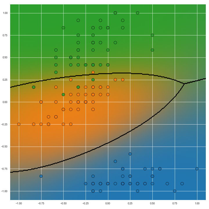
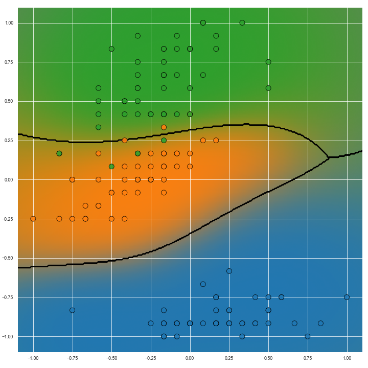
The image below show predictions on the same task but with non-linear predictive models. Particularly with the image on the right, we can see how the transition from the ‘green’ to ‘blue’ (right hand side of the image) classes is more gradual than the transition from ‘green’ to ‘orange’ classes (left hand side of the image). This information could be useful for several reasons but importantly it is missing from Voronoi diagrams.
The full code snippet for plotting these figures is given below.
import matplotlib.pyplot as pl
import seaborn as sns

def prob_conf_plot(X, y, clf, buf=0.1, cmap=None,
                   viz_type=None, n_samples=301, alpha=1.0):
    """

    Args:
        X: 2d ndarray, NxD.
            The input features. This function expects that D=2
            (i.e. that the problem is two dimensional).
        y: 1d ndarray, length of N.
            The labels associated with the data, X.
        clf: sklearn model.
            This model must implement the `predict_proba` method.
        buf: real, greater than 0. Default 0.1
            This argument determines how much whitespace to place
            around the limit of the data.
        cmap: colour map. Default: None.
            This argument defines the base colour map for the
            visualised datapoints and for the data that fills it.
            The default system-wide colour map is used when
            this argument is `None`.
        viz_type: must be one of {'hard', 'soft'}. Default: 'soft'.
            Determines the type of visualisation that is to be
            executed. 'hard' produces a visualisation on the
            decision function whereas 'soft' also depicts
            predictive confidence.
        n_samples: int, greater than 0. Default: 301
            Predictions are visualised on a 2D grid over the range
            of the features. This argument determines how many
            samples are used in generating the grid.
        alpha: float, greater than or equal to 0, less than or equal
            to 1. Default: 1
            The transparancy of the visualisation.
    Returns:

    """

    assert X.shape[1] == 2
    if viz_type is None:
        viz_type = 'soft'
    assert isinstance(viz_type, str)
    viz_type = viz_type.lower()
    assert viz_type in {'hard', 'soft'}

    # Determine the extent of the data
    extent = (
        X[:, 0].min() - buf, X[:, 0].max() + buf,
        X[:, 1].min() - buf, X[:, 1].max() + buf,
    )

    # Generate sample points in the range of the data
    xx, yy = np.meshgrid(
        np.linspace(extent[0], extent[1], n_samples),
        np.linspace(extent[2], extent[3], n_samples),
    )

    # Get predictions
    pp = clf.predict_proba(np.c_[xx.ravel(), yy.ravel()])
    if viz_type == 'hard':
        p = np.zeros_like(pp)
        p[np.arange(p.shape[0]), pp.argmax(axis=1)] = 1
        pp = p
    n_classes = pp.shape[1]

    assert np.allclose(pp.sum(axis=1), 1)

    # Get cmap
    if cmap is None:
        cmap = sns.color_palette()

    fig, ax = pl.subplots(1, 1, figsize=(10, 10))
    cols = sns.color_palette(cmap, n_classes)
    pp_rgba = np.zeros((n_samples, n_samples, 4))
    for ci, pi in zip(cols, pp.T):
        cmap_i = pl.cm.colors.ListedColormap(ci)
        pi = pi.reshape(xx.shape)
        pp_rgba += cmap_i(pi) * pi[..., None]
    pp_rgba[..., -1] = np.clip(pp_rgba[..., -1], 0, 1)
    pl.imshow(pp_rgba, alpha=alpha, extent=extent, origin='lower', aspect=1)

    # Plot the decision boundaries
    pl.contour(
        xx, yy, pp.argmax(axis=1).reshape(xx.shape),
        alpha=alpha, colors='k', zorder=1
    )

    # Plot the raw data
    cmap = pl.cm.colors.ListedColormap(cols.as_hex())
    pl.scatter(
        X[:, 0], X[:, 1],
        c=y, s=100,
        cmap=cmap,
        ec='k',
        alpha=0.9
    )

    pl.tight_layout()
The code is by no means new or unique to my processes, but I find myself having to search for it enough to justify putting it up here as a code snippet.
This images above were developed in a jupyter notebook that can be found here: notebook.ipynb
. The notebook has been dumped to a HTML here notebook.html
(with the command jupyter nbconvert --to html notebook.ipynb).
Things to note
- For some tasks (e.g. ordinal regression) is might be preferable to use a base colour map that communicates a scale, e.g. ‘RdBu_r’, ‘Blues’ etc.
- The
prob_conf_plotfunction takes as an input the number of samples for plotting the surface. I chose 301 arbitrarily as the default, but it may be necessary to adjust this according to the task being visualised. - With a high number of colours another default base colour map may be necessary to avoid duplication.
- The line
cmap_i(pi)produces a tensor of size 301x301x4 with the same value. The call can be avoided if preferred simply by repeating the colour value to the right shape.