Animated Local Explanations
Explainability is a part of machine learning is where we try to demystify the factors that influence a particular model prediction, particularly when the predictive functions are complex and nonlinear. In a typical paper or a blog that you may read, you'll see explanations visualised in a nice static image. I was recently after reading a paper and afterwards was inspired to produce animations of explanations, as well as a few additional insights.
Context
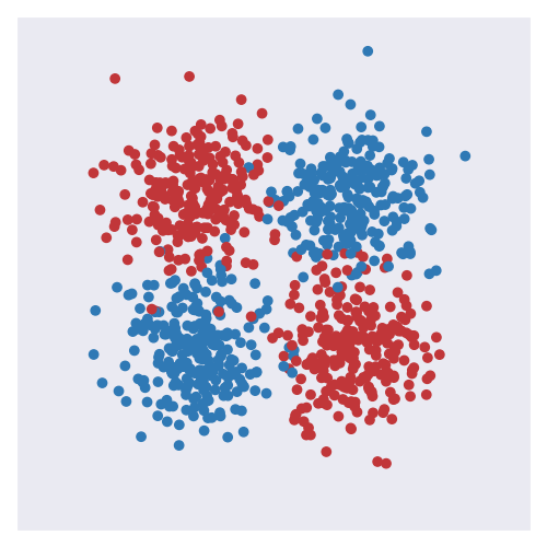
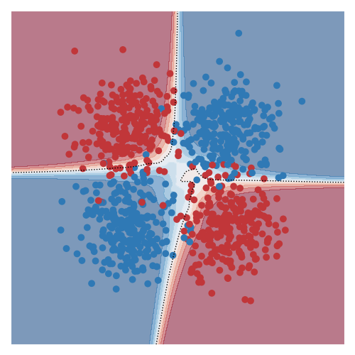
The two images below shows the classical toy XOR dataset: on the left the datapoints of the two class (red and blue) are shown, and on the right the predictions of a model trained on the dataset are shown (the background colour corresponds to confidence in the predicted class).
Although the dataset here is pretty simple and we can understand it completely from the visual, it nonetheless cannot be solved with a single linear decision boundary. Models that solve problems of this sort are not seen typically as ‘interpretable’ or ‘explainable’ owing to the nonlinear and complex relationship between the input and output. For example, the predictive function I used was a dense neural network with 3 layers and 10 hidden units with rectified units after each layer.
The key idea that the linked paper (and many others) explores is that by using simple models in the right way, we can obtain explanations of predictions in small (or local) regions of space.
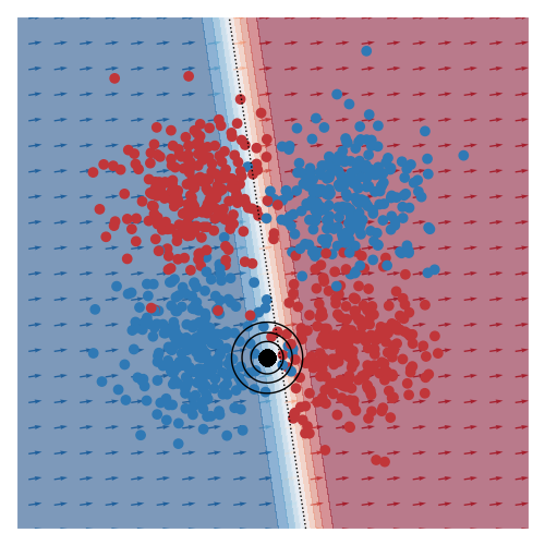
The image below gives an example of this idea using linear logistic regression as the class of explanatory models. The black circles marks the ‘query’ region, that is the local region in the feature space that we want to be explained by the local logistic model. We want good accuracy within these circles, and we don’t care about accuracy far away from these circles. The background colour corresponds to the predicted class of the model. In the vicinity of the query region, we can see that the red and blue datapoints tend to fall on the correct side of the decision boundary. However, the predicted accuracy of points that are far the query region are effectively irrelevant to the region of interest, and can either be correct or not. For example, the bottom left blue cluster, being far from the query region, is predicted red.
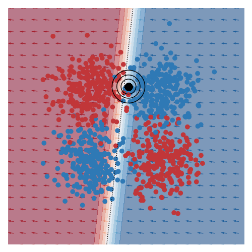
This model is more interpretable than the original neural network since we can see that the dominant factor influencing the predicted class is the feature along the x-axis. You can also see this visually based on the direction of the little arrows.
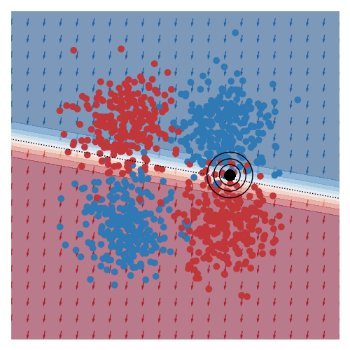
The explanation of another query region can be found here.
Animations
The main reason why I’m writing this post is that I really wanted to see animations of some of the images in the paper I was reading. As a simple scenario, I’ve made the query region move around in circles through the feature space.
I’ve also animated this for two other toy datasets, commonly known as moons and circles.
I thought these animations were pretty nice. Although I was hoping that I would see a smooth animation, I was somewhat surprised that the smoothness in the animation wasn’t hard to come by.
Update 08-02-2022: On twitter, I was asked what these images might look like in higher dimensions than the 2D cases that I’ve showed above. I came up with this. This is more complex than the examples from above. Here, query centre is the black dot, local region around query shown by transparency, and local prediction is shown by hyperplane colour.
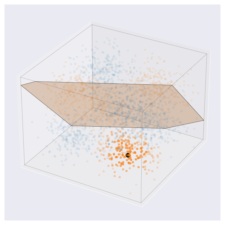
I think this looks pretty neat. If you look at the animation enough I think you can interpret it pretty naturally.
Effect of bandwidth
In my implementation, the query region is defined by an RBF kernel, which is fully specified by location and a bandwidth parameters. While animations above show the effect of the query position, they ignore the effect that bandwidth has on performance metrics of interest (e.g. accuracy).
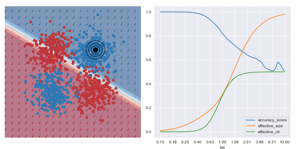
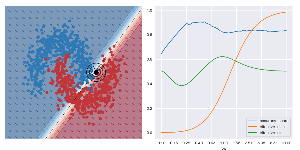
This is what is shown in the image below on the right where a few metrics are plotted against bandwidth (bw) on the XOR dataset at a specific query region in feature space. With small bandwidths, we get very high accuracy (blue trace). This is because the query location is in a dense region of space (orange trace) with highly negative class distribution (green trace). As the query bandwidth grows large enough, the non-linear traits of the dataset need to be increasingly accounted for, but these traits cannot be modelled by the simple explanatory model class. Thus the predictive accuracy diminishes to the class priors which in turns leads to unreliable explanations.
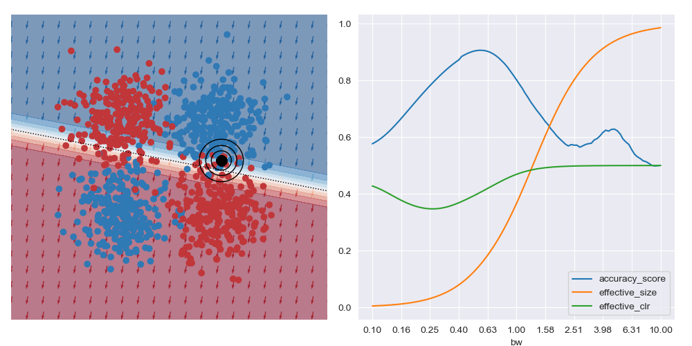
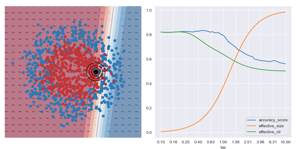
On the other hand, if the query location is close to the boundary between classes (in the image below) the best accuracy (and possibly best explanations) are obtained with larger bandwidths. Very small bandwidths tend to over-fit to the local properties of the data in these boundary regions.
This shows that context is important when soliciting explanations: with too little you risk seeing over-fitted explanations, and with too much you may risk explaining too much.
Bandwidth animations
I’ve also animated these bandwidth effect charts. These take a bit of time to parse. Generally speaking, as the query location approaches the boundary between classes that wider bandwidths give higher accuracy. And when the query location is in a region with highly skewed class ratios, the smallest bandwidth seems to give the best accuracy.
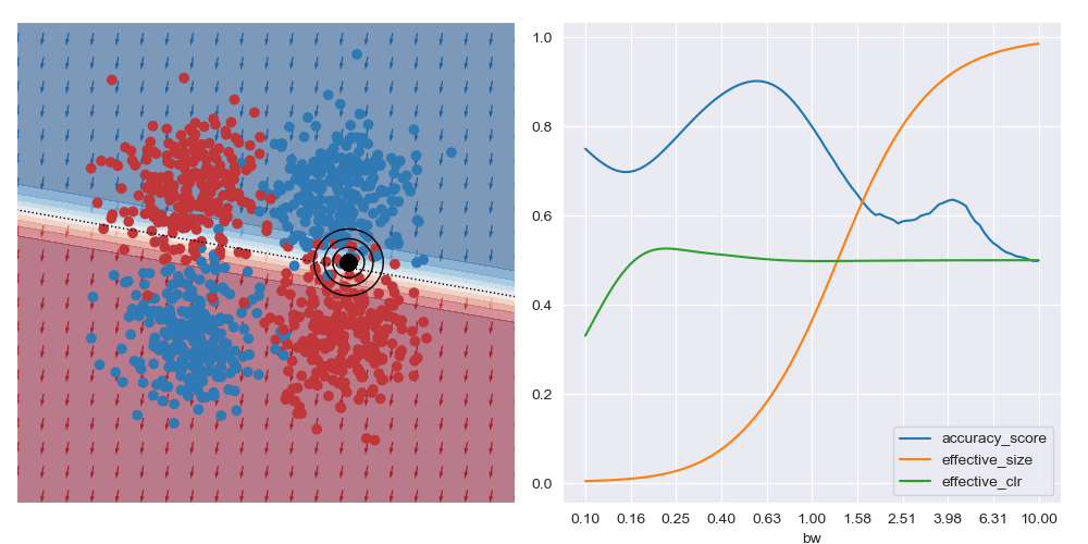
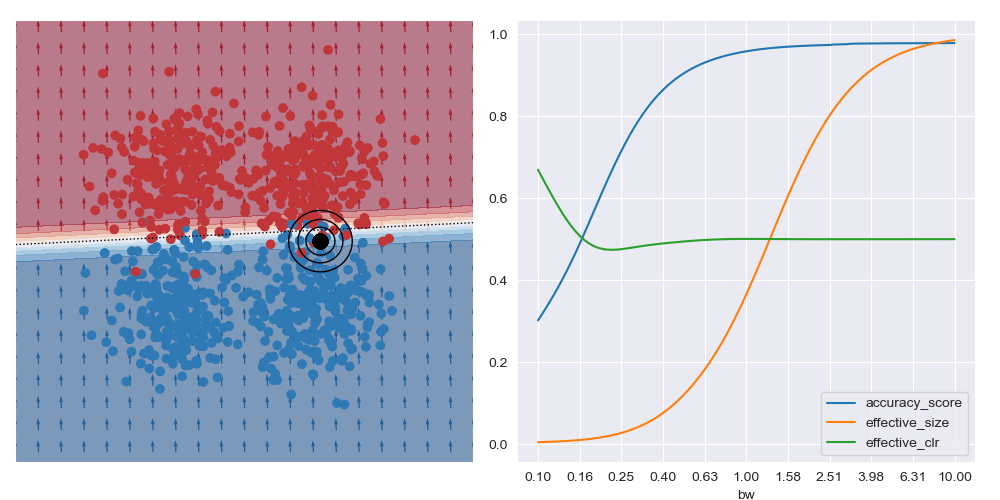
It’s generally always worth interrogating what happens with linear datasets too. For the image below I simplified the XOR dataset to have a linear boundary, but kept the neural network architecture from above. We can see that the local is basically the same for all query regions, and that the most accurate results are obtained with the largest bandwidth considered. To me, this indicates that the dataset local and global explanations are effectively equivalent, and it may be possible to make this testable in a formal way. You also get artefacts on accuracy measures with small bandwidths near decision boundaries, as expected.
Choosing the bandwidth
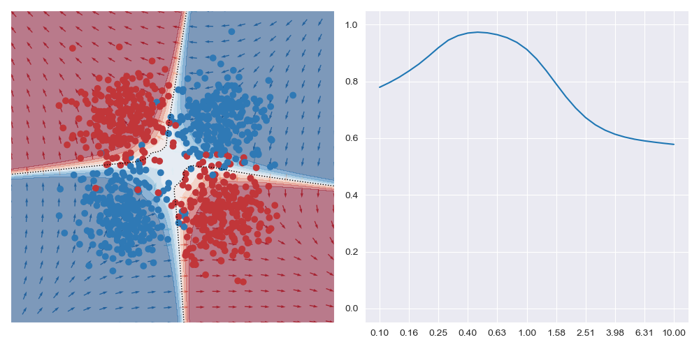
Given that the bandwidth affects accuracy and probably explanations, a natural question is how one might decide on a bandwidth. The answer probably depends on the particular question that you’re asking. We’ve seen that if you’re querying in a region with highly skewed class ratio that small bandwidths seem lead to good accuracy, but if you’re close to the class decision boundary that larger bandwidths seem to be preferable. So, concretely I wanted to know is without any information on the query region, what bandwidth should I suggest. I think of this as an unconditional query.
I approached this problem in an entirely un-interesting way and exhaustively evaluated accuracy across a wide range of query locations and over a range of bandwidths. The image below is what resulted for the XOR dataset. The outcome of this seems to follow some of the intuitions that were gained in the paragraphs above: small bandwidths overfit and may not result in optimal accuracy. The maximal value in the right trace seems to be a compromise between fitting the local and global traits. (Note: this image in log-scaled on the x axis so that the details can be more easily seen. In reality, the peak is quite narrow.)